Custom CSS Basics - Colors, Text Effects, Fonts, and Layouts
CSS stands for “Cascading Style Sheets” - a coding language to help you display custom layouts, colors, effects, and fonts for your campaign. You can use it to transform the default pages that Obsidian Portal provides into a look that’s tailor-made just for you and your gaming group. By inserting one string of CSS code, you can upgrade the look of many pages, throughout your campaign.
Please Note:
- Custom Styling is an Ascendant Only feature that is available for GM’s and co-GM’s of a campaign.
- This is an advanced feature. It allows for maximum flexibility, but like any coding project, it may require you to experiment and look for solutions. You can ask for help here on our forums by searching for topics or by clicking the “New Discussion” button to ask your question.
- Changing the CSS of your campaign won't change or delete your data (pages, characters, items, etc), but you may end up accidentally hiding the links to the data so no one can get to it. Check your pages often as your work on your custom designs.
- We highly recommend learning the basics of the built-in Developer Tools that come with your web browser, before you begin. Here is an article that gives a brief overview. Inspectors/Explorers can help you find the name of the elements you’re trying to style. Dev Tools like Chrome Developer Tools allow you to manually edit the CSS on your pages in case you make a mistake that prevents you from further CSS edits.
- If you accidentally hide or move a critical link or campaign management element (like the Custom CSS input field), don’t worry. It is still there. You will just need to use your Inspect/Explore tool to un-hide or re-locate the needed section so you can access it again.
Getting Started
To start customizing your campaign, log in to Obsidian Portal, navigate to the campaign you want to work on, and click on your “Settings” tab on the left sidebar menu (the gears icon). Click on the “Advanced” tab on the upper right of the screen and scroll down until you see the fields labeled “Custom CSS,” “TypeKit ID,” and “Google Fonts.” These sections allow you to customize the look of your campaign.
If these fields are locked out, it means you need to upgrade to an Ascendant membership in order to access them.
If you’re brand new to CSS, you can look up tutorials, templates, syntax, code definitions, examples, and advanced concepts here: w3schools.com.
Custom Colors and Text Effects
There are already a lot of color options available in the “Settings > Style” menu and by using color features that come with our text-editors. For example, when editing text, insert this line of code to create a blue-colored sentence: %{color:blue}This line of text will appear blue.% Additionally, CKEditor has text-color and background-color tools in the toolbar. To apply color changes and special effects to many elements of your campaign all at once, however, you can save time by using Custom CSS.
Modern browsers support many different colors, and you can use either the English name or an associated code to apply colors with CSS.
Use your Inspect/Explore tools to pinpoint the name of the HTML element you want to style. Then, go to the “Settings > Advanced > Custom CSS” field. You will put in the HTML element (also known as the Selector), open curly bracket, the property you want to change (like color), colon, the name or code of the color (like Crimson), a semi-colon, close curly bracket. Here are some examples, preceded by comments to tell you what they do:
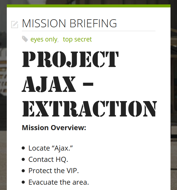
/* APPLIES COLORS, BOLD, AND DROP SHADOW TO WIKI TITLES */
.wiki-page-name {
   background-color: DarkGoldenRod;
   color: Red !important;
   font-weight: bold;
   text-shadow: 2px 2px #8B0000;
}
/* CHANGES WIKI PAGES FROM WHITE TO GOLD */
body.campaign-public-layout .post-section.post-main {
   background-color: Gold;
}
Note that the !important property in the above example is sometimes needed to override colors inherited from other rules on the site. Once you have typed in your CSS code, hit “Save” in the bottom right corner to save your changes. Here is what the example CSS produces:

Custom Fonts
The term “font” refers to the design of the lettering on your campaign pages. There are many fonts available, everything from ancient, handwritten script to futuristic neon symbols, so you can customize the look of your text to match the theme of your game or world. On Obsidian Portal, there are two ways to adjust fonts - Google Fonts and TypeKit from Adobe. You will add the font to the campaign and then use custom CSS to apply that font to specific text.
To use Google Fonts, visit https://fonts.google.com/ and search for fonts that you want to use. All you need to know is the name of the font. For example: Homemade Apple. In your “Settings > Advanced > Google Fonts” area, press the plus symbol and type in the name of the font you wish to add. Press “Tab” to add it to the list. You may add more than one font.
Now, you can use the “Custom CSS” field to apply the new font to various elements in your campaign. Here is a simple example of what you need to put into the CSS field to make the font work.
/* ADDS A HANDWRITTEN SCRIPT FONT TO ALL h5 TEXT */
h5 {
   font-family: 'Homemade Apple';
}
Hit “Save” in the bottom right corner to save your changes. In this example, any text using the h5 heading will appear as the handwritten script.

To use TypeKit ID, visit https://fonts.adobe.com/fonts and search for a font that you want on your page. Then, look for the </> symbol to access the ID and CSS name for that font (you may need to make an account with Adobe for full access). The ID will look something like this: btl8oet and the CSS name will look something like this: stencil-std.
Type the ID into the “TypeKit ID” field. Then, you can use the “Custom CSS” field to apply the new font to various elements in your campaign, as in this example:
/* ADDS A MILITARY STENCIL FONT TO ALL h1 TEXT */
h1 {
   font-family: stencil-std,sans-serif;
   font-weight: 400;
   font-style: normal;
}
Hit “Save” in the bottom right corner to save your changes. In this example, any text using the h1 heading will use the military stencil.
Custom Layouts
The layout of pages (both singularly and collectively) in your campaign’s main content area can have a big impact on many aspects of your campaign site. Things such as readability, usability, aesthetics, viewer engagement, and page-type delineation can be helped or hindered depending on the layout. For example, consider the following two “Main Page” wiki pages:

Fundamentally, both are simply a “list of links” that lead to other wiki pages. But ask yourself, which is more engaging as a viewer? Which is more aesthetically pleasing? Which can you use to feed supplemental information about your campaign’s setting to the viewer without needing to have one additional word on the page itself? By applying a layout that enables each link to have an associated background image, we greatly enhance the look of the page, and give it more of a “menu” feeling to the viewer. Here’s a quick sample (using the page names from above):
The first step here is to put the links on the page in such a way that we can add the appropriate styling from our Custom CSS input field to construct our “menu”. This is accomplished by way of div elements. In HTML “div” is short for division, so by defining a div element, we are saying that we want the material inside to be its own separate portion of our page. In this case, we will have an overall container div (called “my-menu”) and a numerically-named container div for each link inside of the “my-menu” container.
<div class="my-menu">
    <div class="my-menu-1">[[Locations]]</div>
    <div class="my-menu-2">[[Politics]]</div>
    <div class="my-menu-3">[[Timeline]]</div>
    <div class="my-menu-4">[[Corporations]]</div>
    <div class="my-menu-5">[[The Underground]]</div>
    <div class="my-menu-6">[[Cyber Gangs]]</div>
    <div class="my-menu-7">[[Weapons]]</div>
    <div class="my-menu-8">[[Hardware]]</div>
    <div class="my-menu-9">[[Software]]</div>
</div>
Once we have saved our page, it’s time to add the CSS styling rules that will turn this collection of links and divs into a visually appealing menu. In CSS, rules can be applied to elements by type (such as div) or by an identifying name (such as our “my-menu” class names). We’ll be doing a bit of both for our menu. Navigate to the “Settings” tab, then click on the “Advanced” area and find the Custom CSS input field. This is where we will place our rules.
The first thing to style here is our “my-menu” div container. Since our menu will be comprised of a series of clickable image blocks, we’ll be displaying our container as a grid. In CSS, a grid is a two-dimensional system made up of rows and columns. By applying a grid display type to our container element (also known as the “parent” element) our inner (or “child”) elements are set into the grid framework automatically (though we can manually manipulate them if desired). CSS grids have a ton of options (far more than we will be illustrating with our humble menu), so we highly encourage you to find a guide,or read up on CSS Grid Layout when working on layouts for your campaign site pages.
/* CONSTRUCT THE GRID */
.my-menu {
    display: grid;
    grid-template-columns: repeat(3, 1fr);
    grid-gap: 10px;
}

/* CONVERT TO 1 COLUMN ON PHONE */
@media only screen and (max-width: 420px) {
    .my-menu {
        grid-template-columns: 1fr;
    }
}
Looking at this first chunk of style rules, we can see that the 3-column grid is established, with each column having a width measurement of “1fr”. While pixels might be familiar to most members (and we do use those in the setup for the gap between grid elements), chances are the fr unit isn’t. Essentially, it’s an even portion of whatever space on the screen isn’t being taken up by other elements. When we use “fr” in our grid column declaration, we are basically saying give us three columns of equal width, based on the available screen width. For usability purposes, we overwrite this 3-column setup to be only 1 column when the menu is viewed on a screen that is sized for a cell phone.
Next, we will configure the rules that apply to all of our child divs inside the menu. While each will be given individual styling for their background image, we want everything else about them to be the same. This means we need to use a generic selector to set up some of the basics before the background images are added. In this case, all of our elements are of type div, and they are all inside of an element named “my-menu”. Thus we can select them all with “.my-menu div”, as seen below:
/* SET RULES FOR GRID’S CHILD ELEMENTS */
.my-menu div {
    position: relative;
    overflow: hidden;
    height: 150px;
    border: 2px solid black;
}
So at this point, we have constructed our grid, and configured all of our elements inside of it to have some basic common rules. Our menu still has some issues, however. For starters, only the wording of the link is clickable, rather than the entire block. To fix this, we need to expand the link element (an “a” element) to cover the entire surface of the block. For style purposes, we also want the link text to be in the bottom center of the block, as opposed to the upper left. As before, we’ll be using a generic selector to get all of the links in our menu at the same time.
/* STYLE AND POSITION LINKS */
.my-menu a {
    text-align: center;
    position: absolute;
    bottom: 0px;
    width: 100%;
    padding: 150px 0px 4px 0px;
    color: white !important;
    text-shadow: -1px -1px 0 #000, 1px -1px 0 #000, -1px 1px 0 #000, 1px 1px 0 #000, 2px 2px #000000;
}
In the above snippet, we take advantage of the “position” rules that we established in both the “a” elements and their parent “div” elements to move the text to the bottom of the block. We center the text, make sure our link width is equal to the width of the entire block and then add padding to the top and bottom of the link to ensure that it covers the entire height of the block. Finally, rules are added to overwrite the standard link color and text-shadow is applied to make sure the link wording pops off of the background image.
With our grid, child elements, and links configured, we’re nearly done. Now we can assign the background images to our individual blocks. Each block will be targeted individually this time, to assign the desired image. For the sake of brevity, a code snippet “template” is provided in place of 9 specific (functionally identical) examples.
.my-menu .my-menu-x {
    background-image: url(‘INSERT URL TO IMAGE HERE’);
}
And there we have it; a basic retooling of our “list of links” into a “menu” of clickable tiles. As one might expect, there are tons of additional styling options that we could apply - things like :hover effects, animations, and transformations.
Final Note:
Don’t forget - if you get stuck, the best place to ask for help is in our forums, where expert gamers and CSS pros are always happy to assist.